Product Updates
·
5 min
read
Designing the Specify CLI
Lessons learned designing a Command-Line Interface (CLI).

In a world where we’re surrounded by screens everywhere (in the street, in our house, on our bodies), we tend to forget what a significant portion of today’s makers are experiencing when giving life to digital products. A dark blank canvas, with less than 1,000 pixels in width and 800 pixels in height with no other animations than a blinking box. Welcome to the terminal, the mid-1960s interface people uses on the first computers and that we still use nowadays.
Tools like Warp, iTerm, Hyper.js, and ZSH, are sometimes the first ones to be installed on developers’ machines when setting up, as the terminal is one of their primary tools. Developers may also add customization and powerful features to make their terminal a little friendlier.
The core of the terminal lies in the Command-Line Interfaces (CLIs) experience provided by products like NPM, Yarn, GitHub, JEST, Stripe, and Squoosh — just to name a few. They succeeded in bringing interactivity on a screen not really optimized for that.
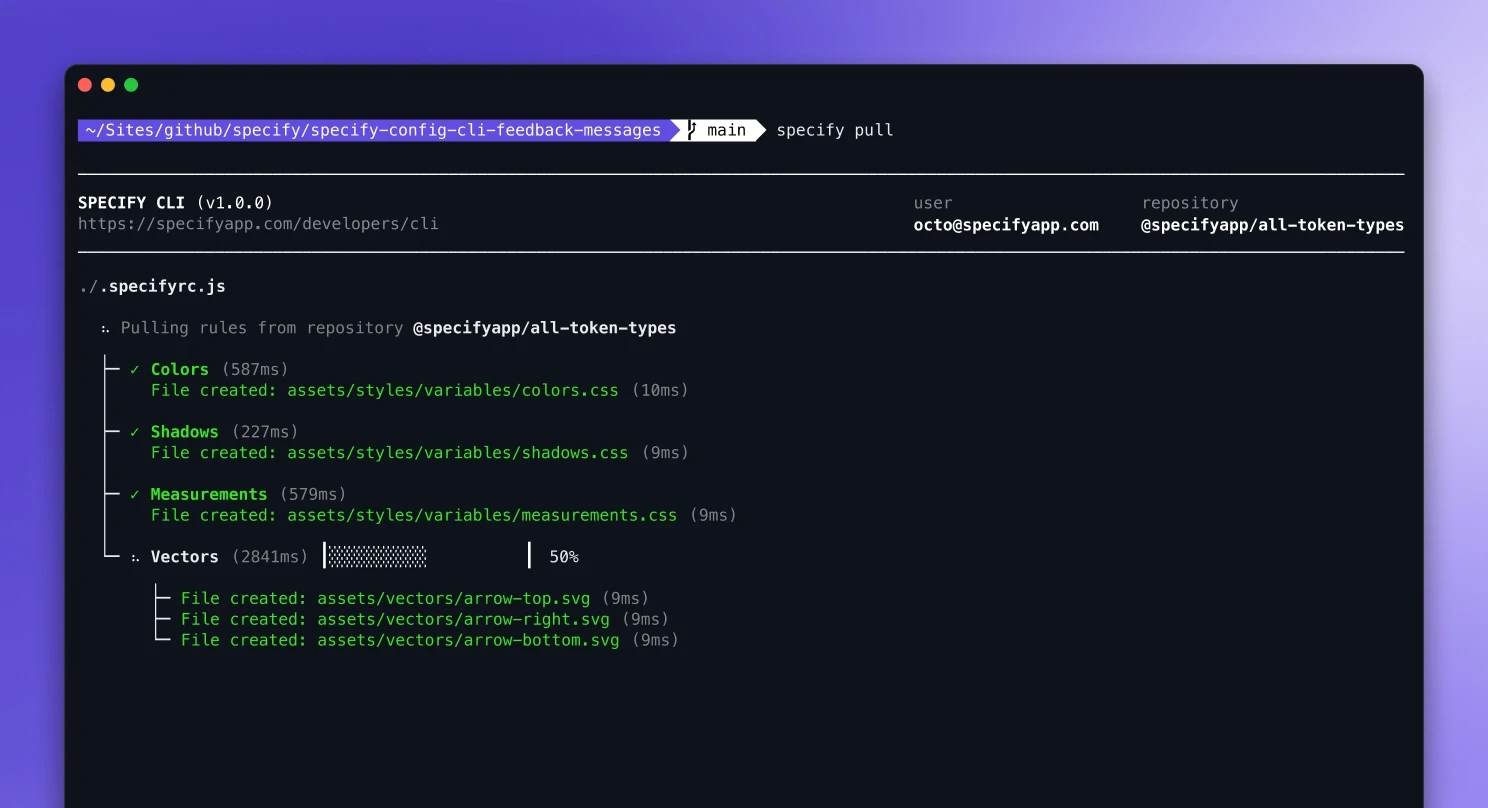
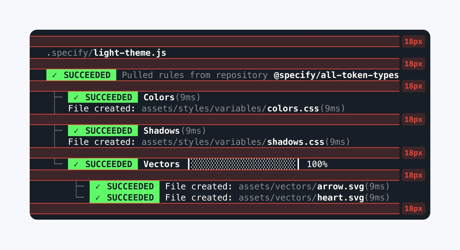
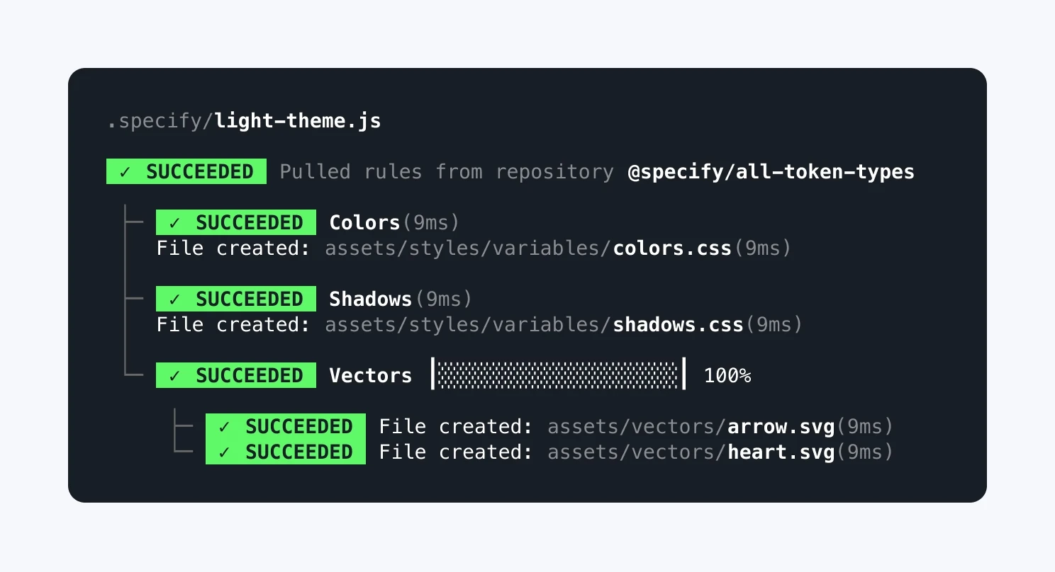
At Specify, we provide a CLI to developers to let them interact with our Design Data Platform. The Specify CLI helps you sync design tokens and assets from Sources, like a Figma file, and to pull them to get a fully configurable output directly in their codebase — whatever your technologies are.
The Specify CLI is the developer tool companion for configuration file creation and iteration. It provides you feedback to validate your configuration and help you understand the logic behind rules and parsers.
An unusual but fun playground
As a designer, designing for the first time a CLI isn’t really something you feel immediately comfortable with.
Let’s dive into each category — colors, typography, spacing, animations, components — and see how we can get the most out of the CLI possibilities.
Colors
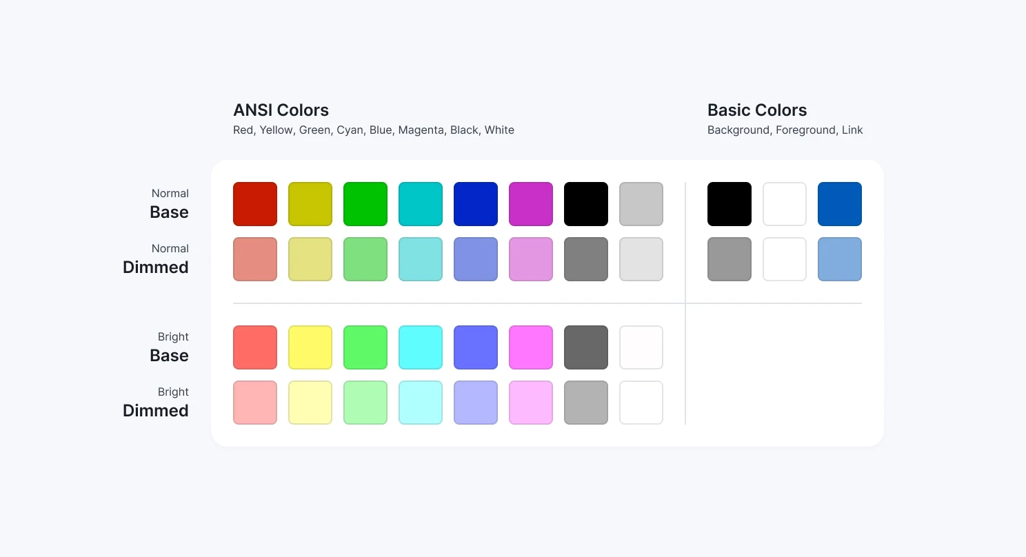
You have to deal with a strict amount of colors:
16 ANSI colors (with a normal and bright version for each): black, red, green, yellow, blue, magenta, cyan ;
3 “basic” colors: foreground, background and link colors — note that there is no user’s preferences detection regarding light or dark theme affecting the background and foreground colors here.
Each of these 19 colors has a dimmed variation (around 50% opacity), leading to a total of 38 colors. You can also use ANSI escape codes, but you can’t be sure if the user’s terminal is correctly handling it. And on top of that, users can override your design decisions anytime with the terminal's preferences! We’re very far from what we’re used to with modern web & app development.
Colors available when designing for CLI
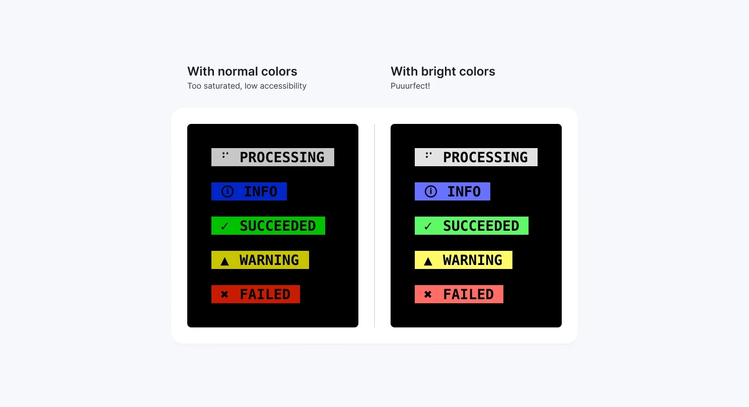
We wanted to step away from very saturated colors for the Specify CLI. Instead, we added pastel vibes to prevent our users from losing sight while executing the pull command. We ensured every label background and foreground color had a good contrast ratio with Stark (above 4.5:1).
Label color accessibility
In our first trials, we dealt with a very “Matrix-vibe”: a lot of green (or red if errors), not very easy to read. We stepped back from this option and decided to choose something more subtle for descriptions and paths, with foreground-dimmed (basically a gray if the foreground color is set to white).
Matrix vibes
Pastel vibes
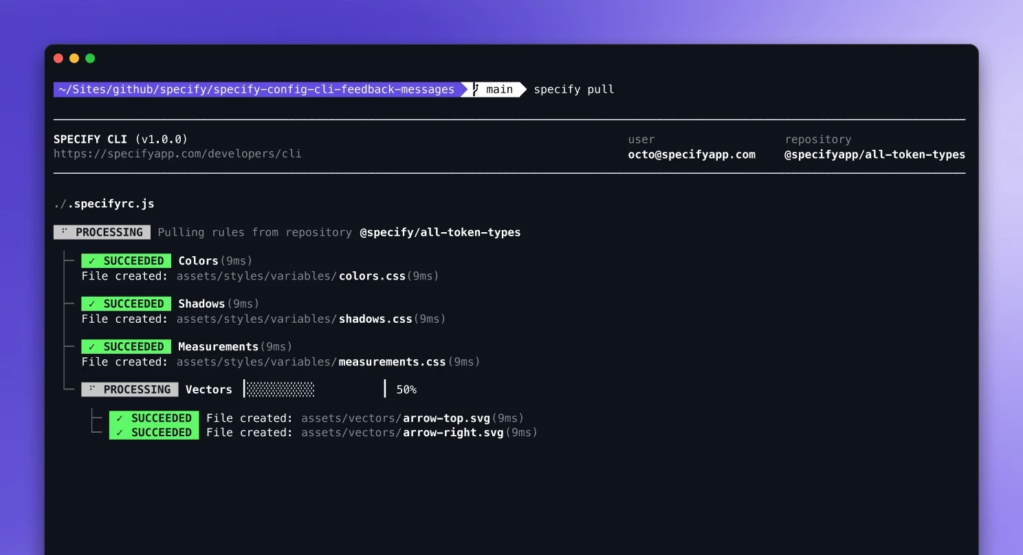
We were using bold text in our labels, and terminals have by default the “Brighten bold text” — which uses a gray instead of a black color, ugly and not accessible. As a workaround, we used “inverted colors” — inspired by JEST: you set the color on the label, and the text plays the role of a mask. As a result, your text takes the color of the background, and voilà.
Typography & Spacing
Let’s talk a bit about typography. No exception here: Users can override every design decision: both font choices and font parameters (font-size, leading, kerning, etc). As a rule of thumb, we used a monospace font to have the most representative idea of the final interface.
At Specify, we designed it with the Meslo typeface (one of the most popular fonts for terminals). We also really like the Fira Code characters, the one we use in our platform and our documentation.
What about spacings, flows, and grids? Sorry friends, no exception here, again. You have to deal with an airport flight table, where spacing can only exist with a space character. All your spacings choices depend on the font the user uses. As a result:
Your horizontal spacings should use the width of a character (same for each character with a monospace font). For example, with a font like Meslo and font size set to 14px, it’s 9px. So, all your spacings should be a multiplier of 9: 18, 27, 36, etc.
Your vertical spacings should use the same height as your character, so the line-height. Line-height is often set to 1em by default, so 14px in our example. You can also set it to 18 or maybe 20px. All your spacings should be a multiplier of this number. In our example: 14, 28, 42, etc. Again, the user has the final word here. Keep in mind: Don’t hesitate to use an additional line of spacings between two elements for the best possible reading experience.
Vertical spacing: multiple of 18
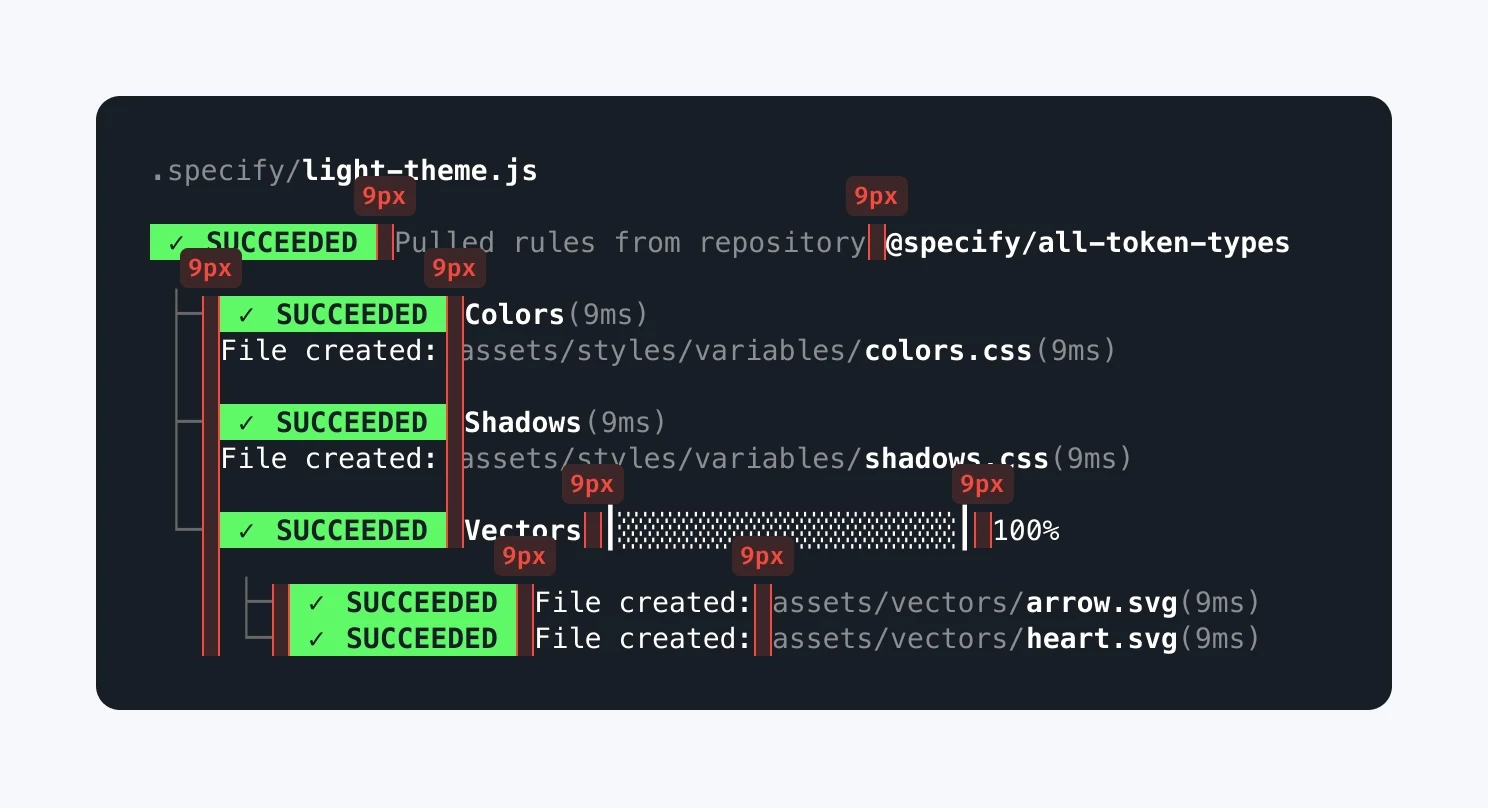
Horizontal spacing: multiple of 9
Animations
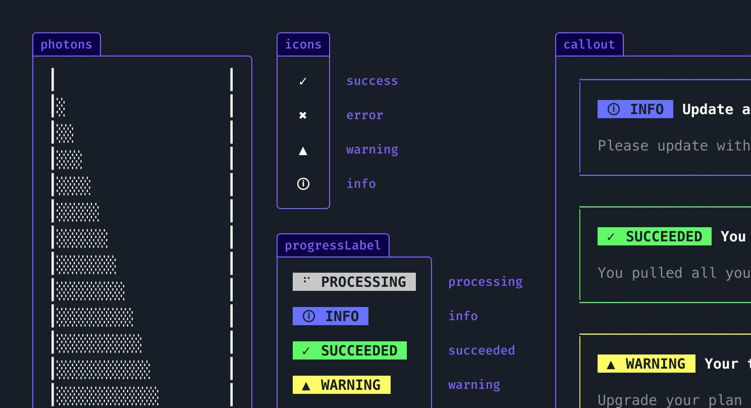
Let’s put it simply. No animations, no transitions, only characters. The world of UTF-8 is really fun to explore, and you might find some creative combinations to represent lists, progress bars, and semantics.
To design the Specify CLI, we chose the classic-but-efficient snake-dots for loaders and some kind of photons-like characters to mimic our design data platform pipeline animation in our video for progress bars. For our icons, we found their four characters for semantic-state: info, success, warning, and error.
Animated components
We transformed each of these characters into a Figma Component and Variant. We used Interactive Components to make the transition between loading bar states with an after delay of 80ms to mimic the terminal speed while pulling design tokens and assets, itself contained in a header or a label component.
Components
Speaking of components, we were lucky. Ink helped us a lot in building bridges between design and code. Each label, header, callout, and rule has its own component in Figma and VS Code. We couldn’t really use design tokens here, unfortunately (and yes, we’d have loved to do some dogfooding with Specify here) as we used system colors and user preferences.
Components in Figma
Making graphical user interfaces fun again
Designing a CLI is definitely a different exercise compared to « traditional » UI work: your only friends here are UTF-8 characters — no vector shapes, no effects, nothing else 😅
I had great fun designing the Specify CLI to provide our users with the best possible developer experience. Give it a spin, and let us know what you think!