Getting Started
·
5 min
read
Adding 50+ design token types to Specify, what does that mean for your design system?
Avoid complexity when adding more design tokens to your design system. Learn how to get ready to scale.

Design tokens exist at the heart of every design system. They can come in various types, depending on the design elements they represent. Here are some common types of design tokens, which we all know:
Colors: Design tokens for colors define the color palette used in a design system. They typically include primary colors, secondary colors, background colors, text colors, and any other color variations required for the project.
Typography: Typography tokens define the fonts, font sizes, line heights, and other typographic properties used in a design. They specify the various heading styles, paragraph styles, and any other text-related specifications.
Spacing: Spacing tokens represent the spacing values used for margins, padding, and other spatial relationships in a design. They define consistent spacing values to ensure consistent alignment and layout across different components.
Measurements: Size tokens define the dimensions of components, such as width, height, and icon sizes. They establish consistent measurements for UI elements, making it easier to create balanced and visually harmonious designs.
Shadows: Shadow tokens specify the values for box shadows and other shadow effects used in a design. They define the shadow properties, such as color, offset, blur radius, and spread, ensuring a consistent visual style across the project.
Borders: Border tokens define the properties of borders, including color, width, style, and radius. They establish consistent border styles for elements like buttons, cards, and containers.
These are just a few examples of design token types and Specify handles all of them in the current product, so transforming them into any code format you would like, is automatically possible nowadays. You can find more info in our Guide.
Adding more token types
Depending on the complexity and requirements of a project, additional token types may be defined, such as gradients, animations, icons, or any other design attribute that needs to be standardized and shared across the project. The specific design token types used in a project will depend on the design system's needs and the components and visual elements being defined.
At this point Specify is adding more and more types of design tokens, which can be transformed and distributed directly into your codebase. Ultimately, this means users of Specify are able to handle more complex requirements of design systems. Here are the token types we’re adding, thanks to the new Specify Design Token Format, at the base of the Specify platform.
Token types that Specify will be able to handle by using the new Specify Design Token Format:
What to keep in mind when adding more design tokens to your design system?
When adding more design tokens to your design system, it's important to consider several factors to ensure a successful and cohesive expansion.
Consistency is key
Consistency: Maintain consistency within your design system by aligning new design tokens with existing ones. Ensure that new tokens adhere to established design principles, naming conventions, and guidelines. Consistency in design tokens helps create a unified and coherent visual language across your projects. To enhance consistency in your design system, naming of your tokens becomes more and more important. Use clear and descriptive names for new design tokens that accurately represent their purpose and usage. Update your documentation to include the new tokens, providing clear explanations and examples of how they should be used. Consistent and well-documented design tokens make it easier for designers and developers to understand and utilize them effectively.
Are you ready to scale?
Always consider the scalability of your design system when introducing new design tokens. Think about how the new tokens will integrate with existing components and styles, and how they can accommodate future growth and variations in your projects. Ensure that the design system remains flexible and adaptable to different contexts and requirements. Scalability also means to keep in mind what the impact would be on existing components when adding new design tokens.
Assess the potential impact of new design tokens on existing components and styles in your design system. Evaluate whether the introduction of new tokens requires updates to existing components or if it necessitates the creation of new ones. Ensure that the design tokens work harmoniously with the existing system without introducing conflicts or inconsistencies.
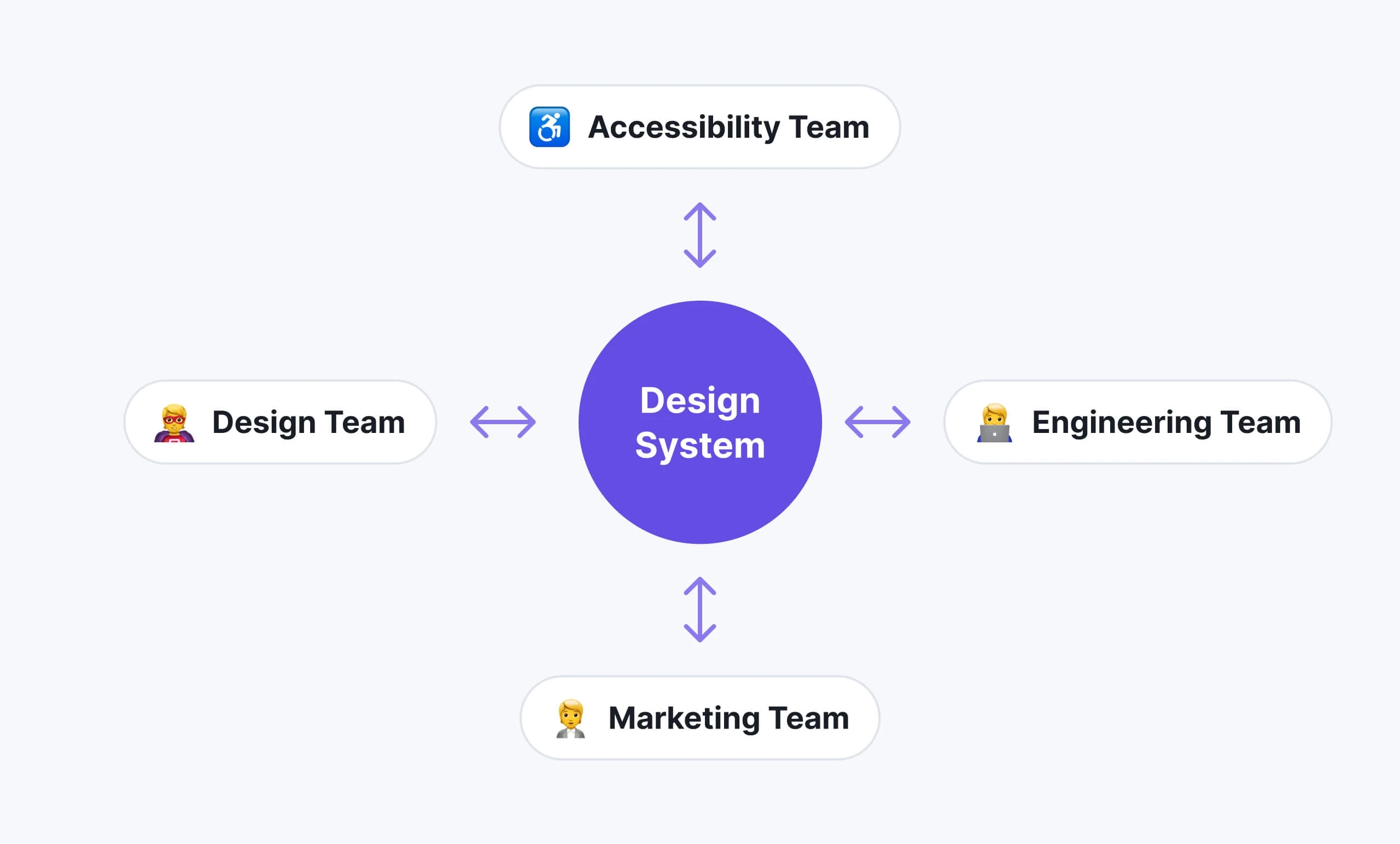
Involving relevant stakeholders in the creation of your design system is crucial
Collaboration at the heart of your design system
Collaboration and communication are crucial when adopting your (complex) design system within your team. Involving relevant stakeholders (designers, developers, product teams, or even marketing) in the process of adding new design tokens should not be forgotten. Encourage collaboration and open communication to gather insights, feedback, and suggestions. By involving the right people, you can ensure that the new tokens align with project needs and are embraced by the team. Involving the right people will give you a head start too for the testing and validation of the new design tokens. By testing the tokens in various scenarios and across different platforms and devices you can easily verify their effectiveness and ensure they produce the desired visual results. Conduct thorough testing and validation to identify any issues or unintended consequences that may arise from the addition of new tokens.
Adopting the design system
Educate your team members on the purpose, usage, and benefits of the new design tokens. Provide training or resources to help designers and developers understand and adopt the new tokens effectively. Promote awareness and understanding of the expanded design system to facilitate its successful integration into your projects.
Make sure to educate your team members when adding new design tokens
Automating your design system
By considering these aspects, you can ensure a smooth and successful integration of new design tokens into your design system. Resulting in a more sophisticated design system, with more structure and a higher consistency. Using tools like Specify will make it easier to handle all of these tokens within your design system - automatically. So both designer and front-end developer have full control and are always up-to-date. Join the beta program today.